Integrations open dialogs by sending an HTTP POST, containing some data in the request body, to an endpoint on the Mattermost server. Integrations can use this endpoint to open dialogs when users click message buttons or select an option from a menu, or use a
custom slash command.
Moreover, plugins can trigger a dialog based on user actions. For instance, if a plugin adds a button in the channel header, clicking that button may open a dialog.
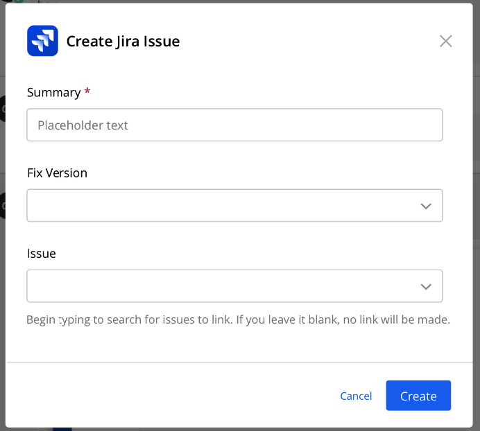
Here is an example of what a dialog looks like for creating a Jira issue within the Mattermost user interface:
To open a dialog, your integration must first receive an HTTP request from the Mattermost server. This request will be triggered by a slash command or an interactive message. It will include a trigger ID.
Once you have the trigger ID you can use it to open the interactive dialog by sending an HTTP POST request to https://<your-mattermost-url>/api/v4/actions/dialogs/open. See the below section for what to include in the body of that HTTP request.
Interactive dialogs support the following parameters:
| Parameter | Type | Description |
|---|---|---|
title |
String | Title of the dialog. Maximum 24 characters. |
introduction_text |
String | Markdown-formatted introduction text which is displayed above the dialog elements. |
elements |
Array | See below for more details on elements. If none are supplied the dialog box acts as a simple confirmation. |
url |
String | The URL to send the submitted dialog payload to. |
icon_url |
String | (Optional) The URL of the icon used for your dialog. If none specified, no icon is displayed. |
submit_label |
String | (Optional) Label of the button to complete the dialog. Default is Submit. |
notify_on_cancel |
Boolean | (Optional) When true, sends an event back to the integration whenever there’s a user-induced dialog cancellation. No other data is sent back with the event. Default is false. |
state |
String | (Optional) String provided by the integration that will be echoed back with dialog submission. Default is the empty string. |
source_url |
String | (Optional) URL for field refresh requests. When a select element with refresh: true changes value, Mattermost sends a refresh request to this URL. Also used as the endpoint for multi-step form responses. |
Sample JSON is given below. Form submissions are sent back to the URL defined by the integration. You must also include the trigger ID you received from the slash command or interactive message.
{
    "trigger_id": "<unique ID generated by the server>",
    "url": "<URL to send the submitted request to>",
    "dialog": {
        "callback_id": "<ID specified by the integration to identify the request>",
        "title": "<title of the dialog>",
        "introduction_text": "<Text describing the dialog box content>",
        "elements": ["<Array of UI elements to display in the dialog>"],
        "submit_label": "<label of the button to complete the dialog>",
        "notify_on_cancel": false,
        "state": "<string provided by the integration that will be echoed back with dialog submission>",
        "source_url": "<optional URL for field refresh and multi-step form handling>"
    }
}
Each dialog supports elements for users to enter information.
text: Single-line plain text field. Use this for inputs such as names, email addresses, or phone numbers.textarea: Multi-line plain text field. Use this field when the answer is expected to be longer than 150 characters.select: Message menu. Use this for pre-selected choices. Can either be static menus or dynamic menus generated from users and Public channels of the system. For more information on message menus, see the documentation.bool: Checkbox option. Use this for binary selection.radio: Radio button option. Use this to quickly select an option from pre-selected choices.date: Date picker field. Use this for selecting dates without time information.datetime: Date and time picker field. Use this for selecting both date and time with timezone support.Each element is required by default, otherwise the client will return an error as shown below. Note that the error message will appear below the help text, if one is specified. To make an element optional, set the field "optional": "true".
Text elements are single-line plain text fields. Below is an example of a text element that asks for an email address.
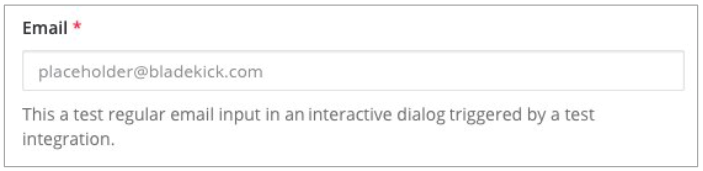
{
    "display_name": "Email",
    "name": "email",
    "type": "text",
    "subtype": "email",
    "placeholder": "placeholder@example.com"
}
There is an optional "subtype": "email" field in the above example, which specifies the keyboard layout used on mobile. For this example, the email keypad is shown to the user given the subtype is set to email.
The full list of supported fields is included below:
| Field | Type | Description |
|---|---|---|
display_name |
String | Display name of the field shown to the user in the dialog. Maximum 24 characters. |
name |
String | Name of the field element used by the integration. Maximum 300 characters. You should use unique name fields in the same dialog. |
type |
String | Set this value to text for a text element. |
subtype |
String | (Optional) One of text, email, number, password (as of v5.14), tel, or url. Default is text. Use this to set which keypad is presented to users on mobile when entering the field. |
min_length |
Integer | (Optional) Minimum input length allowed for an element. Default is 0. |
max_length |
Integer | (Optional) Maximum input length allowed for an element. Default is 150. If you expect the input to be greater 150 characters, consider using a textarea type element instead. |
optional |
Boolean | (Optional) Set to true if this form element is not required. Default is false. |
help_text |
String | (Optional) Set help text for this form element. Maximum 150 characters. |
default |
String | (Optional) Set a default value for this form element. Maximum 150 characters. |
placeholder |
String | (Optional) A string displayed to help guide users in completing the element. Maximum 150 characters. |
Textarea elements are multi-line plain text fields. A sample JSON is provided below:
{
    "display_name": "Ticket Description",
    "name": "ticket_description",
    "type": "textarea",
    "help_text": "Provide description for your ticket."
}
The maximum length for a textarea is 3,000 characters.
The list of supported fields is the same as for the textarea type element.
| Field | Type | Description |
|---|---|---|
display_name |
String | Display name of the field shown to the user in the dialog. Maximum 24 characters. |
name |
String | Name of the field element used by the integration. Maximum 300 characters. You should use unique name fields in the same dialog. |
type |
String | Set this value to texareat for a textarea element. |
subtype |
String | (Optional) One of text, email, number, password (as of v5.14), tel, or url. Default is text. Use this to set which keypad is presented to users on mobile when entering the field. |
min_length |
Integer | (Optional) Minimum input length allowed for an element. Default is 0. |
max_length |
Integer | (Optional) Maximum input length allowed for an element. Default is 3000. |
optional |
Boolean | (Optional) Set to true if this form element is not required. Default is false. |
help_text |
String | (Optional) Set help text for this form element. Maximum 150 characters. |
default |
String | (Optional) Set a default value for this form element. Maximum 3000 characters. |
placeholder |
String | (Optional) A string displayed to help guide users in completing the element. Maximum 3000 characters. |
Select elements are message menus that allow users to select one or multiple predefined options from a list. Below is an example of a select element that asks for one of three different options.
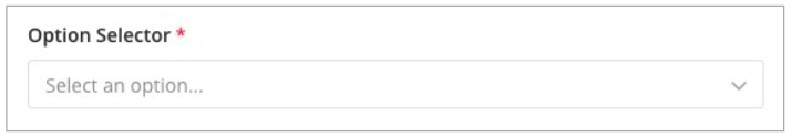
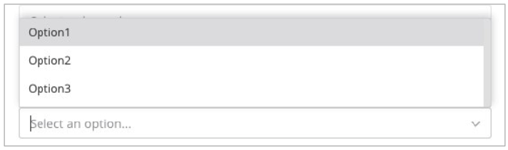
{
    "display_name": "Option Selector",
    "name": "options",
    "type": "select",
    "options": [
         {
             "text": "Option1",
             "value": "opt1"
         },
         {
             "text": "Option2",
             "value": "opt2"
         },
         {
             "text": "Option3",
             "value": "opt3"
         }
    ]
}
Select elements can be configured to allow multiple selections by setting the multiselect parameter to true. When multiselect is enabled, users can choose multiple options from the list.
{
    "display_name": "Multiple Options",
    "name": "multi_options",
    "type": "select",
    "multiselect": true,
    "default": "opt1,opt3",
    "options": [
         {
             "text": "Option1",
             "value": "opt1"
         },
         {
             "text": "Option2",
             "value": "opt2"
         },
         {
             "text": "Option3",
             "value": "opt3"
         }
    ]
}
For multiselect elements, default values can be specified as a comma-separated string (e.g., "opt1,opt3" to pre-select Option1 and Option3).
Select elements can be configured to load options dynamically from an external API endpoint. This enables real-time filtering, searching, and loading of options based on user input.
To use dynamic select, set data_source: "dynamic" and provide a data_source_url that points to your lookup endpoint:
{
    "display_name": "Dynamic Options",
    "name": "dynamic_field",
    "type": "select",
    "data_source": "dynamic",
    "data_source_url": "https://your-mattermost-server.com/plugins/your-plugin-id/api/lookup",
    "placeholder": "Search for options..."
}
When users interact with a dynamic select field, Mattermost sends an HTTP POST request to the /api/v4/actions/dialogs/lookup endpoint, which proxies the request to your data_source_url. The payload uses the same SubmitDialogRequest structure:
{
    "type": "dialog_lookup",
    "url": "<your data_source_url>",
    "callback_id": "<callback ID>",
    "state": "<state>",
    "user_id": "<user ID>",
    "channel_id": "<channel ID>",
    "team_id": "<team ID>",
    "submission": {
        "query": "user_search_input",
        "selected_field": "dynamic_field",
        "other_field_name": "current_value"
    }
}
The submission map contains query (the user’s search input), selected_field (the field being searched), and current values of all other form fields.
Your endpoint should respond with an array of options:
{
    "items": [
        {
            "text": "Option 1",
            "value": "option1"
        },
        {
            "text": "Option 2",
            "value": "option2"
        }
    ]
}
Security Requirements:
/plugins/) are proxied locally and do not require HTTPSDynamic select with multiselect:
{
    "display_name": "Multiple Dynamic Options",
    "name": "multi_dynamic_field",
    "type": "select",
    "multiselect": true,
    "data_source": "dynamic",
    "data_source_url": "https://your-mattermost-server.com/plugins/your-plugin-id/api/lookup",
    "placeholder": "Search and select multiple options..."
}
The select element can also be generated dynamically from users and channels of the system.
For users, use:
{
    "display_name": "Assignee",
    "name": "assignee",
    "type": "select",
    "data_source": "users"
}
For multiple user selection:
{
    "display_name": "Multiple Assignees",
    "name": "assignees",
    "type": "select",
    "multiselect": true,
    "data_source": "users"
}
For Public channels, use:
{
    "display_name": "Post this message to",
    "name": "channel",
    "type": "select",
    "data_source": "channels"
}
For multiple channel selection:
{
    "display_name": "Post to multiple channels",
    "name": "channels",
    "type": "select",
    "multiselect": true,
    "data_source": "channels"
}
The list of supported fields for the select type element is included below:
| Field | Type | Description |
|---|---|---|
display_name |
String | Display name of the field shown to the user in the dialog. Maximum 24 characters. |
name |
String | Name of the field element used by the integration. Maximum 300 characters. You should use unique name fields in the same dialog. |
type |
String | Set this value to select for a select element. |
multiselect |
Boolean | (Optional) Set to true to allow multiple selections from the list. Default is false. |
data_source |
String | (Optional) One of users, channels, or dynamic. If none specified, assumes a manual list of options is provided by the integration. |
data_source_url |
String | (Optional) URL for dynamic option loading when data_source is dynamic. Must be HTTPS or a /plugins/ path. |
refresh |
Boolean | (Optional) When true, triggers a field refresh request to the dialog’s source_url when this field’s value changes. Use this for dependent dropdowns or conditional form fields. Default is false. |
optional |
Boolean | (Optional) Set to true if this form element is not required. Default is false. |
options |
Array | (Optional) An array of options for the select element. Not applicable for users, channels, or dynamic data sources. |
help_text |
String | (Optional) Set help text for this form element. Maximum 150 characters. |
default |
String | (Optional) Set a default value for this form element. For multiselect, use comma-separated values. Maximum 3,000 characters. |
placeholder |
String | (Optional) A string displayed to help guide users in completing the element. Maximum 3,000 characters. |
From Mattermost v5.16 you can use checkbox elements. It looks like a plain text field with a checkbox to be selected. Below is an example of a checkbox element that asks for meeting feedback.

{
    "display_name": "Can you please select below",
    "placeholder": "The meeting was helpful.",
    "name": "meeting_input",
    "type": "bool"
}
The full list of supported fields is included below:
| Field | Type | Description |
|---|---|---|
display_name |
String | Display name of the field shown to the user in the dialog. Maximum 24 characters. |
name |
String | Name of the field element used by the integration. Maximum 300 characters. You should use unique name fields in the same dialog. |
type |
String | Set this value to bool for a checkbox element. |
optional |
Boolean | (Optional) Set to true if this form element is not required. Default is false. |
help_text |
String | (Optional) Set help text for this form element. Maximum 150 characters. |
default |
String | (Optional) Set a default value for this form element. true or false. |
placeholder |
String | (Optional) A string displayed to include a label besides the checkbox. Maximum 150 characters. |
From Mattermost v5.16 you can use radio elements. It looks like a plain text field with a radio button to be selected. Below is an example of a radio element that asks for a department.

{
    "display_name": "Which department do you work in?",
    "name": "department",
    "type": "radio",
    "options": [
        {
            "text": "Engineering",
            "value": "engineering"
        },
        {
            "text": "Sales",
            "value": "sales"
        },
        {
            "text": "Administration",
            "value": "administration"
        }
    ],
    "help_text": "Please indicate your department as of January 1.",
    "default": "engineering"
}
The full list of supported fields are included below:
| Field | Type | Description |
|---|---|---|
display_name |
String | Display name of the field shown to the user in the dialog. Maximum 24 characters. |
name |
String | Name of the field element used by the integration. Maximum 300 characters. You should use unique name fields in the same dialog. |
type |
String | Set this value to radio for a radio element. |
options |
Array | (Optional) An array of options for the radio element. |
help_text |
String | (Optional) Set help text for this form element. Maximum 150 characters. |
default |
String | (Optional) Set a default value for this form element. |
Date elements provide native date picker functionality for selecting dates without time information. Below is an example of a date element for event scheduling.

{
    "display_name": "Event Date",
    "name": "event_date",
    "type": "date",
    "default": "2024-03-15",
    "placeholder": "Select a date",
    "help_text": "Choose the date for your event",
    "optional": false,
    "datetime_config": {
        "min_date": "today",
        "max_date": "+30d"
    }
}
The full list of supported fields for date elements is included below:
| Field | Type | Description |
|---|---|---|
display_name |
String | Display name of the field shown to the user in the dialog. Maximum 24 characters. |
name |
String | Name of the field element used by the integration. Maximum 300 characters. You should use unique name fields in the same dialog. |
type |
String | Set this value to date for a date element. |
default |
String | (Optional) Default value in ISO date format (YYYY-MM-DD) or relative format (today, tomorrow, +1d, +1w, +1M, +1y). Full ISO datetime strings are accepted, but only the date part is parsed; timezone information is ignored. |
placeholder |
String | (Optional) Placeholder text shown in the input field. Maximum 150 characters. |
help_text |
String | (Optional) Help text displayed below the field. Maximum 150 characters. |
optional |
Boolean | (Optional) Set to true if this form element is not required. Default is false. |
datetime_config |
Object | (Optional) Nested date configuration object. See datetime_config object for supported properties. |
min_date |
String | (Deprecated — use datetime_config.min_date.) Earliest selectable date. Supports ISO date format (YYYY-MM-DD) or relative formats (today, tomorrow, +1d, -7d, etc.). Full ISO datetime strings are accepted, but only the date part is parsed; timezone information is ignored. |
max_date |
String | (Deprecated — use datetime_config.max_date.) Latest selectable date. Supports ISO date format (YYYY-MM-DD) or relative formats (today, +30d, +1y, etc.). Full ISO datetime strings are accepted, but only the date part is parsed; timezone information is ignored. |
Basic date selection:
{
    "display_name": "Project Deadline",
    "name": "deadline",
    "type": "date",
    "help_text": "When is this project due?",
    "datetime_config": {
        "min_date": "today"
    },
    "optional": false
}
Date range with relative defaults:
{
    "display_name": "Flexible Date",
    "name": "any_date",
    "type": "date",
    "help_text": "Any date within the next year",
    "datetime_config": {
        "min_date": "today",
        "max_date": "+1y"
    },
    "default": "+1w",
    "optional": true
}
DateTime elements provide combined date and time picker functionality with timezone support. Below is an example of a datetime element for meeting scheduling.

{
    "display_name": "Meeting Time",
    "name": "meeting_time",
    "type": "datetime",
    "default": "2024-03-15T14:30:00Z",
    "placeholder": "Select date and time",
    "help_text": "Choose when the meeting should start",
    "optional": false,
    "datetime_config": {
        "min_date": "today",
        "max_date": "+7d",
        "time_interval": 30
    }
}
The full list of supported fields for datetime elements is included below:
| Field | Type | Description |
|---|---|---|
display_name |
String | Display name of the field shown to the user in the dialog. Maximum 24 characters. |
name |
String | Name of the field element used by the integration. Maximum 300 characters. You should use unique name fields in the same dialog. |
type |
String | Set this value to datetime for a datetime element. |
default |
String | (Optional) Default value in ISO datetime format (RFC3339) or relative format. For relative dates, time defaults to noon. When specifying a time, it must align with datetime_config.time_interval (be a multiple of the interval). |
placeholder |
String | (Optional) Placeholder text shown in the input field. Maximum 150 characters. |
help_text |
String | (Optional) Help text displayed below the field. Maximum 150 characters. |
optional |
Boolean | (Optional) Set to true if this form element is not required. Default is false. |
datetime_config |
Object | (Optional) Nested datetime configuration object. See datetime_config object for supported properties. |
min_date |
String | (Deprecated — use datetime_config.min_date.) Earliest selectable date. Supports ISO format or relative formats (today, tomorrow, +1d, -7d, etc.). |
max_date |
String | (Deprecated — use datetime_config.max_date.) Latest selectable date. Supports ISO format or relative formats (today, +30d, +1y, etc.). |
time_interval |
Integer | (Deprecated — use datetime_config.time_interval.) Time selection interval in minutes. Must be between 1 and 1440, and must be a divisor of 1440 to create evenly spaced intervals throughout the day. Common values: 15, 30, 60, 90, 120. Default is 60. |
Meeting scheduler with business hours:
{
    "display_name": "Meeting Time",
    "name": "meeting_time",
    "type": "datetime",
    "help_text": "Select a time during business hours",
    "datetime_config": {
        "min_date": "+1d",
        "max_date": "+14d",
        "time_interval": 30
    },
    "optional": false
}
Event with custom time intervals:
{
    "display_name": "Event Start Time",
    "name": "event_start",
    "type": "datetime",
    "help_text": "When does your event begin?",
    "datetime_config": {
        "min_date": "today",
        "max_date": "+90d",
        "time_interval": 15
    },
    "default": "today"
}
Fixed location timezone with manual entry:
{
    "display_name": "Conference Start",
    "name": "conference_start",
    "type": "datetime",
    "help_text": "All attendees see this time in the conference timezone",
    "datetime_config": {
        "location_timezone": "America/Denver",
        "manual_time_entry": true,
        "time_interval": 30
    }
}
The datetime_config object groups date/datetime configuration into a single nested structure. It is supported on both date and datetime elements.
| Field | Type | Applies to | Since | Description |
|---|---|---|---|---|
min_date |
String | date, datetime |
11.8 | (Optional) Earliest selectable date. Supports ISO format or relative formats (today, +1d, etc.). |
max_date |
String | date, datetime |
11.8 | (Optional) Latest selectable date. Supports ISO format or relative formats (+30d, +1y, etc.). |
time_interval |
Integer | datetime |
11.6 | (Optional) Time selection interval in minutes. Must be between 1 and 1440, and must be a divisor of 1440. Default is 60. |
location_timezone |
String | datetime |
11.6 | (Optional) IANA timezone used to display and submit the time (e.g. America/Denver, Asia/Tokyo). When set, all users see the same wall-clock time regardless of their own timezone. Defaults to the viewing user’s timezone. |
manual_time_entry |
Boolean | datetime |
11.8 | (Optional) When true, users can type the time directly in addition to using the dropdown. Default is false. |
allow_manual_time_entry |
Boolean | datetime |
11.6 (deprecated in 11.8) | (Deprecated — use manual_time_entry.) When both are set, either enabling turns the feature on. |
Backward compatibility (new in 11.8): The top-level min_date, max_date, and time_interval fields on date and datetime elements are still accepted for existing integrations, but are deprecated in favor of datetime_config. When both are provided on the same element, values inside datetime_config take precedence over the legacy top-level values.
Relative Date Formats:
today: Current datetomorrow: Next dayyesterday: Previous day+Nd: N days from today (e.g., +1d, +7d)+Nw: N weeks from today (e.g., +1w, +2w)+NM: N months from today (e.g., +1M, +6M)+Ny: N years from today (e.g., +1y)-Nd: N days ago (e.g., -1d, -7d)ISO Format Examples:
2024-03-15 (YYYY-MM-DD)2024-03-15T14:30:00Z (RFC3339 format)2024-03-15T14:30:00-05:00Form Submission Format:
2024-03-152024-03-15T14:30:00-05:00Localization:
Validation:
datetime_config.time_interval must be a divisor of 1440 (24 hours in minutes)time_interval (be a multiple of the interval)Time Interval Examples:
"time_interval": 15 creates options: 00:00, 00:15, 00:30, 00:45, 01:00, etc."time_interval": 30 creates options: 00:00, 00:30, 01:00, 01:30, etc."time_interval": 60 creates options: 00:00, 01:00, 02:00, 03:00, etc."time_interval": 7 (7 is not a divisor of 1440)When a user submits a dialog, Mattermost will perform client-side input validation to make sure:
The submission payload sent to the integration is:
{
    "type": "dialog_submission",
    "callback_id": "<callback ID provided by the integration>",
    "state": "<state provided by the integration>",
    "user_id": "<user ID of the user who submitted the dialog>",
    "channel_id": "<channel ID the user was in when submitting the dialog>",
    "team_id": "<team ID the user was on when submitting the dialog>",
    "submission": {
        "some_element_name": "<value of that element>",
        "some_other_element": "<value of some other element>"
    },
    "cancelled": false
}
Optionally, the dialog can send an event back to the integration if notify_on_cancel parameter is set to true. If this happens, cancelled will be set to true on the above payload, and submission will be empty.
Moreover, Mattermost also allows the integration itself to perform input validation. This can be done by responding to the dialog submission request with a JSON body containing an errors field. The errors field can contain a JSON object, mapping input field names to string error messages you would like to display to the user. For example, if you have a field named num_between_0_and_10, you can enforce the user to enter a number between 0 and 10 by returning the following response body if the condition isn’t satisfied:
{"errors": {"num_between_0_and_10": "Enter a number between 0 and 10."}}
The integration may also return a generic error message to the user that is not attached to a specific field. This can be done by responding to the dialog submission request with a JSON body containing an error field. The error field should contain a string with the error message to display to the user. For example, if a server-side error occurs, you can return a message explaining it:
{"error": "Failed to fetch additional data. Please try again."}
Support for generic error messages was added in Mattermost v5.18.
Finally, once the request is submitted, we recommend that the integration responds with a system message or an ephemeral message confirming the submission. This should be a separate request back to Mattermost once the service has received and responded to a submission request from a dialog. This can be done either via the REST API, or via the Plugin API if you’re developing a plugin.
Multi-step dialogs enable wizard-like form experiences where users progress through multiple steps to complete a complex workflow. Each step can have different fields, and form values are accumulated across steps.
Multi-step behavior is achieved by having your submit handler return a new form instead of closing the dialog. No special dialog property is required.
state field to track which step you’re on (e.g., "step_1").dialog_submission request with type: "dialog_submission".type: "form" and a form object containing the next step’s dialog definition.{"type": "ok"} to close the dialog.Each step submission uses the standard dialog submission format:
{
    "type": "dialog_submission",
    "callback_id": "<callback ID>",
    "state": "step_1",
    "user_id": "<user ID>",
    "channel_id": "<channel ID>",
    "team_id": "<team ID>",
    "submission": {
        "step1_field": "value_from_step_1"
    },
    "cancelled": false
}
To advance to the next step, your integration responds with a new form:
{
    "type": "form",
    "form": {
        "callback_id": "multistep_wizard",
        "title": "Setup Wizard - Step 2 of 3",
        "elements": [
            {
                "display_name": "Step 2 Field",
                "name": "step2_field",
                "type": "text"
            }
        ],
        "submit_label": "Next",
        "state": "step_2"
    }
}
On the final step, the submission includes accumulated values from all steps:
{
    "type": "dialog_submission",
    "callback_id": "<callback ID>",
    "state": "step_3",
    "user_id": "<user ID>",
    "channel_id": "<channel ID>",
    "team_id": "<team ID>",
    "submission": {
        "step1_field": "value_from_step_1",
        "step2_field": "value_from_step_2",
        "step3_field": "value_from_step_3"
    },
    "cancelled": false
}
Return an empty response (HTTP 200 with empty body) or {"type": "ok"} to close the dialog.
{
    "trigger_id": "trigger_id_here",
    "url": "https://your-integration.com/dialog",
    "dialog": {
        "callback_id": "multistep_wizard",
        "title": "Setup Wizard - Step 1 of 3",
        "introduction_text": "Welcome to the setup wizard",
        "elements": [
            {
                "display_name": "Project Name",
                "name": "project_name",
                "type": "text",
                "placeholder": "Enter project name"
            }
        ],
        "submit_label": "Next",
        "state": "step_1"
    }
}
Interactive dialogs support dynamic field refresh functionality, allowing fields to be updated based on user input. This is useful for dependent dropdowns or conditional form fields.
To enable field refresh, two things are required:
refresh: true on the element that should trigger refreshes when its value changes.source_url on the dialog to specify where refresh requests are sent.When a user changes a select element that has refresh: true, Mattermost sends a request to the dialog’s source_url via the /api/v4/actions/dialogs/submit endpoint.
The field refresh request uses the standard SubmitDialogRequest structure with type set to "refresh":
{
    "type": "refresh",
    "url": "<source_url>",
    "callback_id": "<callback ID>",
    "state": "<current state>",
    "user_id": "<user ID>",
    "channel_id": "<channel ID>",
    "team_id": "<team ID>",
    "submission": {
        "category": "software",
        "subcategory": "",
        "selected_field": "category"
    }
}
The submission map contains the current values of all form fields, plus a selected_field key indicating which field triggered the refresh. Cleared fields are sent as empty strings.
Your integration should respond with a complete updated dialog wrapped in a form response:
{
    "type": "form",
    "form": {
        "callback_id": "dynamic_form",
        "title": "Dynamic Form",
        "source_url": "/plugins/your-plugin-id/refresh",
        "elements": [
            {
                "display_name": "Category",
                "name": "category",
                "type": "select",
                "refresh": true,
                "options": [
                    {"text": "Software", "value": "software"},
                    {"text": "Hardware", "value": "hardware"}
                ]
            },
            {
                "display_name": "Subcategory",
                "name": "subcategory",
                "type": "select",
                "options": [
                    {"text": "Frontend", "value": "frontend"},
                    {"text": "Backend", "value": "backend"}
                ]
            }
        ],
        "submit_label": "Submit",
        "state": "step_1"
    }
}
The response replaces the entire dialog with the new form definition. The client preserves the user’s current field values where field names match.
{
    "trigger_id": "trigger_id_here",
    "url": "https://your-integration.com/dialog/submit",
    "dialog": {
        "callback_id": "dynamic_form",
        "title": "Dynamic Form",
        "source_url": "/plugins/your-plugin-id/refresh",
        "elements": [
            {
                "display_name": "Category",
                "name": "category",
                "type": "select",
                "refresh": true,
                "options": [
                    {"text": "Software", "value": "software"},
                    {"text": "Hardware", "value": "hardware"}
                ]
            },
            {
                "display_name": "Subcategory",
                "name": "subcategory",
                "type": "select",
                "options": []
            }
        ],
        "submit_label": "Submit",
        "state": "step_1"
    }
}
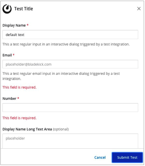
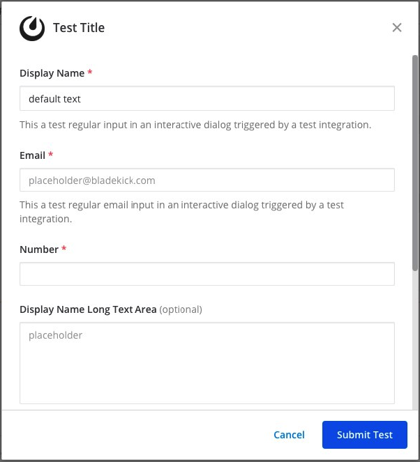
Below is a full example of a JSON payload that creates an interactive dialog in Mattermost:
{
  "trigger_id":"nbt1dxzqwpn6by14sfs66ganhc",
  "url":"http://localhost:5000/dialog_submit",
  "dialog":{
    "callback_id":"somecallbackid",
    "title":"Test Title",
    "icon_url":"https://mattermost.com/wp-content/uploads/2022/02/icon.png",
    "elements":[
       {
          "display_name":"Display Name",
          "name":"realname",
          "type":"text",
          "subtype":"",
          "default":"default text",
          "placeholder":"placeholder",
          "help_text":"This a regular input in an interactive dialog triggered by a test integration.",
          "optional":false,
          "min_length":0,
          "max_length":0,
          "data_source":"",
          "options":null
       },
       {
          "display_name":"Email",
          "name":"someemail",
          "type":"text",
          "subtype":"email",
          "default":"",
          "placeholder":"placeholder@bladekick.com",
          "help_text":"This a regular email input in an interactive dialog triggered by a test integration.",
          "optional":false,
          "min_length":0,
          "max_length":0,
          "data_source":"",
          "options":null
       },
       {
          "display_name":"Number",
          "name":"somenumber",
          "type":"text",
          "subtype":"number",
          "default":"",
          "placeholder":"",
          "help_text":"",
          "optional":false,
          "min_length":0,
          "max_length":0,
          "data_source":"",
          "options":null
       },
       {
          "display_name":"Display Name Long Text Area",
          "name":"realnametextarea",
          "type":"textarea",
          "subtype":"",
          "default":"",
          "placeholder":"placeholder",
          "help_text":"",
          "optional":true,
          "min_length":5,
          "max_length":100,
          "data_source":"",
          "options":null
       },
       {
          "display_name":"User Selector",
          "name":"someuserselector",
          "type":"select",
          "subtype":"",
          "default":"",
          "placeholder":"Select a user...",
          "help_text":"",
          "optional":false,
          "min_length":0,
          "max_length":0,
          "data_source":"users",
          "options":null
       },
       {
          "display_name":"Channel Selector",
          "name":"somechannelselector",
          "type":"select",
          "subtype":"",
          "default":"",
          "placeholder":"Select a channel...",
          "help_text":"Choose a channel from the list.",
          "optional":true,
          "min_length":0,
          "max_length":0,
          "data_source":"channels",
          "options":null
       },
       {
          "display_name":"Option Selector",
          "name":"someoptionselector",
          "type":"select",
          "subtype":"",
          "default":"",
          "placeholder":"Select an option...",
          "help_text":"",
          "optional":false,
          "min_length":0,
          "max_length":0,
          "data_source":"",
          "options":[
             {
                "text":"Option1",
                "value":"opt1"
             },
             {
                "text":"Option2",
                "value":"opt2"
             },
             {
                "text":"Option3",
                "value":"opt3"
             }
          ]
       },
       {
          "display_name":"Multiple Option Selector",
          "name":"somemultioptionselector",
          "type":"select",
          "multiselect":true,
          "default":"opt1,opt3",
          "placeholder":"Select multiple options...",
          "help_text":"You can select multiple options from this list.",
          "optional":true,
          "data_source":"",
          "options":[
             {
                "text":"Option1",
                "value":"opt1"
             },
             {
                "text":"Option2",
                "value":"opt2"
             },
             {
                "text":"Option3",
                "value":"opt3"
             },
             {
                "text":"Option4",
                "value":"opt4"
             }
          ]
       },
       {
          "display_name":"Dynamic Lookup",
          "name":"somedynamicfield",
          "type":"select",
          "data_source":"dynamic",
          "data_source_url":"https://your-mattermost-server.com/plugins/your-plugin-id/api/lookup",
          "placeholder":"Search for dynamic options...",
          "help_text":"Type to search for options from external API",
          "optional":true
       },
       {
          "display_name":"Event Date",
          "name":"eventdate",
          "type":"date",
          "default":"today",
          "placeholder":"Select event date",
          "help_text":"Choose when your event takes place",
          "datetime_config":{
             "min_date":"today",
             "max_date":"+30d"
          },
          "optional":false
       },
       {
          "display_name":"Meeting Time",
          "name":"meetingtime",
          "type":"datetime",
          "default":"",
          "placeholder":"Select meeting date and time",
          "help_text":"Schedule your meeting with date and time",
          "datetime_config":{
             "min_date":"today",
             "max_date":"+14d",
             "time_interval":30
          },
          "optional":true
       }
    ],
    "submit_label":"Submit",
    "notify_on_cancel":true,
    "state":"somestate"
  }
}
If you’ve built an integration for Mattermost, please consider sharing your work in our app directory.
The app directory lists open source integrations developed by the Mattermost community and are available for download, customization and deployment to your private cloud or self-hosted infrastructure.
Like Slack, dialogs are triggered by an interactive message menu or button, or by a custom slash command. Additionally, Mattermost can trigger dialogs via plugins.
The schema for these objects is the same as Slack’s, except for the following differences:
url field must be specified for Mattermost dialogs, which specifies where the request is sent to. In Slack, this is handled by specifying the URL within the Slack app that uses the dialog.icon_url is an optional field to set the icon for Mattermost dialogs. In Slack, the dialogs use the icon set for the app that uses the dialog.label in Slack dialogs is display_name in Mattermost dialogs for a more consistent naming convention with other integration types.hint in Slack dialogs is help_text in Mattermost dialogs for a more consistent naming convention with other integration types.value in Slack dialogs is default in Mattermost dialogs for a more consistent naming convention with other integration types.Moreover, the JSON payload for select type elements matches interactive message menus.